Thursday, June 1, 2017

Resplendent Red-Violet


Silk, wool, glass, metal pin
When I was a kid, red-violet was my favorite crayon color. So, why red-violet? I really don’t know. Crayola red-violet is resplendent color. It’s close to magenta but also has some added red. To me, straight up magenta is a bit harsh, It’s good as an accent; but, somewhat overwhelming as a principle color for an art piece. Not to mention, it doesn’t really match many sofas -- and you know that’s the criterion for selecting art.
Mixed-media experiment. Glass, plastic, acrylic.
When my hair was red-violet, I would get lots of positive comments almost everywhere I went, I think more people would wear red-violet; but, they’re just afraid of standing out that much, I, on the other hand, don’t care. That’s the joy of growing older. I do what I want (said with Cartman accent). Maybe more people would wear red-violet if it were combined with a dignified navy blue.
My proprietary polymer over wood with sterling, gemstones, and pigments.
Much to my joy, Bullseye glass makes a red-violet glass called plum striker. It starts out as a light lavender-blue but turns red-violet when heated. Of course, the perfect foil for this lovely color would be lime green. Well, probably not; but, lime green seems to make an appearance in almost everything I do. It’s the complementary color, after all. It is. It really is.
Crayons.
 Crayola also makes a violet-red crayon. It’s a great color, mind you; but, it’s no red-violet. Red-violet is the perfect color. As a child, it was so perfect a color that I rarely used it. It was just much admired in my crayon box. I wish I had known then just how inexpensive crayons really are. I probably would have used it more often. I guess that’s really a life lesson. In the end, things are really not as valuable as we make them out to be.

Monday, May 15, 2017

Climb Every Mountain

View from our hay field across the valley.
It’s really hard being an artist. It’s not the life shown in the movies. No sleeping until noon. No substance-driven late evenings. No afternoons in the coffee shop or theater. Just a lot of work, a lot of self-doubt, and a lot of pressure. Being an artist means taking a big risk. The risk that your work will not be appreciated. The risk that you won’t like your own work. The risk that your fears will be realized: You really do stink as an artist.
Double rainbow in our valley.
Being an artist is somewhat like being in a dream state in which you need to get to work every day but work is fifty miles away and all of the roads are blocked so you have to walk… in the snow… in flip flops… wearing clothes from Thom Browne’s runway collection.
View from the top ridge looking into the valley where our farm is located.
I saw the Sound of Music when I was five years old. Not really a movie I suggest for a preschool child. I guess my parents wanted me to have nightmares. Along with the scary stuff was the ridiculous idea that a large family with small children would to attempt to cross the Alps on foot without food, water, camping gear, or climbing equipment. Whatever the intent or however they really escaped from Germany, the thing that really stuck in my head was the ending with Climb Every Mountain. It’s kind of an anthem for artists.
Path leading to the top edge of our farm.
Instead of climbing mountains and moving forward, most of us, at some point, start placing mountains in our path. We have these ideas of perfection in our heads and use them as an excuse to avoid moving forward. At least that’s what I do on occasions. Everything must be “perfect” before the next step can commence. Branding must be in place before opening a website. The studio must be completely clean before working. Not really. Sometimes it’s just a matter of just doing it. Climb every mountain. Ford every stream. Follow any path that leads you from where you are now.

Rodgers & Hammerstein -- Climb Every Mountain
Finale -- Climb Every Mountain

Monday, May 1, 2017

Sophisticated Teal


My proprietary polymer over wood with pigments, sterling, and gemstones.
 Teal is my second-best selling color for jewelry right after purple. I’ve always loved teal and frequently wore it during the 1980s when the jewel-tone palette was so important. Maybe that’s why teal sells so well. Most of my clients are about my age and probably remember the “glory days” of power dressing, big hair, big earrings, and Doc Martens.
My proprietary polymer over wood with pigments, sterling, and gemstones.
Teal is a sophisticated color. It somehow mitigated the otherwise garish excess of the 1980s. It re-emerged in 2015 as one of the trending wall colors. In 2016, it became an important fashion color once again. A spring 2016 trend combined teal with spruce. Gucci paired teal and tangerine later that fall.
My proprietary polymer over wood with pigments, sterling, and gemstones.
Teal can be combined with almost any color. Maybe that’s why it is my second-best selling color. I used to make a lot of jewelry with teal. The series of triangles shown on this page all managed to get adorned with teal. These pieces were made before I started working with glass and lime green infiltrated my work. Despite teal’s aesthetic and lucrative appeal, I stopped using it for a while. I think it’s time to add it back into rotation.
My proprietary polymer over wood with pigments, sterling, and gemstones.
I was playing with some watercolors and decided to do a color wheel with teal in the center. I guess I won’t be combining teal with yellow any time soon. I did mix up a lovely shade of resplendent red-violet… or is that violet-red. Ah, cherished crayon colors.
Winsor & Newton professional watercolors.
I’m always happy to see teal resurface as a trending color. As a sci-fi fan, I’d also be happy to see Teal’c; but, that’s indeed another story.

My proprietary polymer over wood with pigments, sterling, and gemstones.

Friday, April 15, 2016

Imagine

ATC -- Art Trading Card -- Imagine -- Done While at Dale Music
The original Star Trek series ran originally from 1966 through 1969. The culture represented in that series portrayed an idealized socialism later described by John Lennon in the song Imagine. John Lennon was a dreamer. I mean that in a good way. All artists are dreamers by nature. Dreams are what drive the creative spirit forward.

What would actually happen to society if we had essentially free housing, power, and food? Would we choose to further our education? Without the actual need to provide for the basics of life, would we continue to work? I don’t know about other professions, but I do know that artists would continue to create. That’s what we do. Unless we create, a little piece of us dies.
ATC -- Art Trading Card -- Love Ya -- Done While at Dale Music
I sometimes wonder what would have happened differently in my life if I had parents who supported my artistic development. I didn’t have those parents. I had parents who ridiculed my art even when I won awards. I sometimes imagine how much farther I would be in my career as an artist. My grade school art teacher was one of the most profoundly influential esteem builders I had as a child. Mrs. Peterson. Wherever you are, thank you. You kept that dream alive in me for all those years.

With all the cuts in arts funding, I fear for the budding artists growing up. Quash their creativity by learning only those things that up the test scores for the schools. Not much of a goal for a society. Imagine what it would be like if creativity were to be allowed to flourish.

John Lennon -- Imagine

Friday, April 1, 2016

Transitional Turquoise

Turquoise and Lime Green Watercolor Study.
I love the color turquoise even though I don’t really wear it very often -- except jewelry, of course. Even so, the color turquoise keeps popping into my head when I consider colors for the farmhouse. I know that’s an odd color choice when my farm is landlocked in the mountains. Maybe it’s a transitional color for me -- signifying the change in my life from a sophisticated urban life to a more simple country life.
Fused Art Glass Pendant -- Bullseye and Wasser Glasses With Enamel.
I don’t really spend a lot of time outside in the city; but, the farm has a lot of reasons to pull me outside. I know the sky isn’t technically turquoise -- it’s azure. Turquoise has more green in it; but, turquoise is a combination of the colors I see at the farm: the azure sky combined with the green of the fields. The view at the farm is a deconstructed turquoise.
Fused Art Glass Pendant -- Bullseye and Wasser Glasses With Enamel.
Turquoise can be a little overwhelming. I don’t think I’d be comfortable in a completely turquoise room. Maybe I’ll just start small… Like the steps to the basement -- see how I like it in real life. Who knows, maybe the whole farmhouse really wants to be turquoise.
Fused Glass Pendant -- Bullseye and Wasser Glass With Enamel.
I do make and sell quite of bit of turquoise and turquoise-colored jewelry. Real turquoise is a big seller for most jewelry designers. It’s a calming color. No one has ever walked into my booth and said, “I’d NEVER wear turquoise.” The same can’t be said for other colors… like orange or yellow. Turquoise is my third bestselling color after posh purple and sophisticated teal.
Polymer/Wood Pin With Paint.
I tend to sell more turquoise glass than I do real turquoise. That’s probably because I make more glass jewelry than stone jewelry. It’s part of that ethical sourcing dilemma. It’s just so much easier to buy Bullseye glass than it is to track where the stones come from and then test them to see if they’re real and/or adulterated. Glass is just, well, unabashedly glass. It doesn’t try to impress with a pedigree (real or made up). It’s just sand and some minerals. I’ve included a few of my favorite turquoise-colored glass pendants for your enjoyment. So, enjoy.
Fused Art Glass Pendant -- Bullseye and Wasser Glasses With Enamel.

Tuesday, March 15, 2016

Tainted Love

Smokey on the left.  Pepper on the right.
More than 20 years ago, we adopted our first dog, Pepper, and a year later adopted our second, Smokey. Now I can’t imagine life without dogs. Smokey is currently the love of my life. Yes, I’ve loved humans too; but, dog love is somehow pure. Human love is always tainted. The old saying is true: “One day, I hope to be the human my dog thinks I am.”

Pepper died on our anniversary a few years ago. We changed our anniversary date to the first day of spring. She was more than sixteen years old which is pretty good considering she was born with a heart defect. She had a heart attack due to a complication from pancreatitis. She survived a month after that; but, pulmonary hypertension finally overwhelmed her. It was so hard to let her go. It was the right thing to do.

Smokey is now over twenty. That’s pretty old for a dog. He’s blind due to complications of glaucoma resulting from cataract surgery. He’s got dementia. He needs me 24/7. I need him 24/7. I know that I won’t have him much longer. He’s been my faithful companion for a long time. It’s been such a privilege to be his human.

I’ve been looking at options for future adoptions. We would never do anything except adopt. I really feel like I’m cheating on Smokey. I do still have him. I wouldn’t get another dog until he crosses the rainbow bridge; but, I feel it’s coming soon. I’ll be taking a break when that day comes. I’ve spent all of my emotional energy on his care. I hardly leave his side.

Most of my life is simply cuddling with him on the couch. I talk to him. He grumbles back. My love is tainted compared to Smokey’s love. I see beyond the moment. I wish I could be like Smokey and enjoy life moment by moment. Be like Smokey. My new life goal.

Gloria Jones -- Tainted Love
Tainted Love

Tuesday, March 1, 2016

Infiltrative Lime Green

Sometimes, you’re drawn to colors as an artist and have no real explanation for your choices. For me, that color is lime green. The Bullseye Glass Co. calls their version of lime green “spring green;” but, it’s still lime green to me. Even though the control freak in me usually plans things down to the minutiae, I don’t necessarily plan out the color schemes when work with glass. I sometimes grab glass colors that speak to me at the moment and design on the fly.

Interchange:  Elegant Writer and a lime green NeoColor II water-soluble wax pastel on watercolor paper.
My friend, Laura Brackenis the master of restraint. I confess that I’m not really good at restraint. In most cases, that “stop now” moment only occurs after I add lime green to a piece. It’s a simple solution to every problem. If the piece isn’t working, I add lime green. It doesn’t matter if the piece starts out as red, purple, blue, or orange. In the end, lime green infiltrates into almost all of my work.
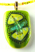
One of my favorite pieces -- Bullseye, Wasser, and dichroic glass with enamel.
I do wear a lot of green. Even lime green. It goes against all of my “autumn” color scheme; but, I don’t care. Lime green is a such a happy color. Almost every other color has a sad version -- dusty pink, colonial blue, mustard yellow. There’s no sad version of lime green.
Bullseye and Wasser glass with enamel.
The pendant I use as my profile picture online is one of my favorite pieces that I’ve made. It’s one of the few that I’ve actually kept. Of course, it has lime green. I know that all of the artists are advised to put up pictures of themselves so their online buyers can feel more of a connection to the work. I’m pretty shy and don’t really play well with others; so, I don’t think I’ll be doing that. I’ll just put up my favorite piece I’ve ever made instead. There. That is me.
Bullseye, Wasser, and dichroic glass with enamel
My profile piece -- Bullseye, Wasser, and dichroic glass with enamel.
I’ve been playing around with color schemes for my website for a while now. The problem is that I seem to love all colors. How do you select a color scheme for your brand? I don’t really know. I think I need some professional graphics designer to help me with that one. The only thing I do know is that I must use lime green. It wouldn’t really represent me without it. I started out using a lot of turquoise and lately I’ve been coming back to it.  Maybe turquoise would be appropriate too in this transitional period in my work. Maybe turquoise and lime green.  Well, definitely lime green.